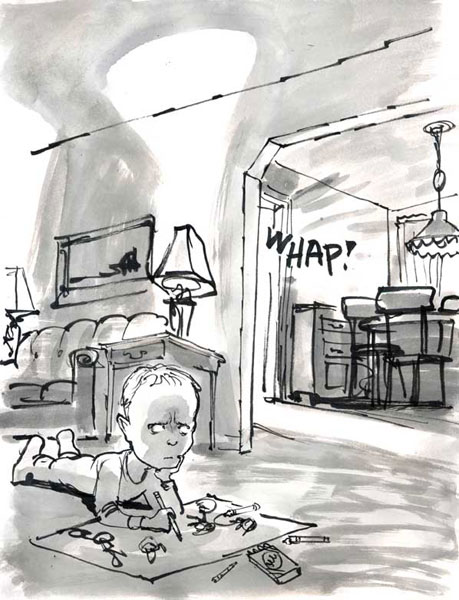
Text people — my tribe — tend not to get graphic stories. Or we struggle to get them. We zip through a whole book in less than an hour and feel cheated. “This could have been a short story!” “I bet the whole book doesn’t have more than a couple of thousand words.”To respond in this way is of course to miss the point. If you’re not allowing yourself to be absorbed into the book’s visual world — if your eye is passing as quickly as possible over the images in order to get to the next words — then you’re not experiencing the book as it was meant to be experienced. In a very meaningful sense, you’re not reading it at all.That said, the artist needs to create a fully-realized visual world for the reader to enter. When that happens, you don’t think about the slightness of the story, the paucity of words, because so much is being communicated by the images that the story feels full. I didn’t like Persepolis all that much, largely because I find the character of the young Marjane Satrapi neither interesting nor attractive, but I thought the world she created with her images a very rich one.By contrast, David Small’s Stitches felt slight to me, the story sketchy and without much nuance, because I didn’t feel that the images conjured up a whole world. The book has been greatly praised, so it’s likely that I’m missing something, but to me the story largely felt like an act of vengeance against Small’s parents, especially against his mother. And while she very well may have deserved his anger, I think most readers tend to sympathize with a narrator more when there seems to be an attempt at fairness — even when the point of the book is to dramatize Small’s experience at the time. Small adds a note at the end, with a photograph of his mother, that suggests a more complex story, but it’s not there in the narrative itself, and I think that’s a problem.But if the book’s visual world were more compelling to me, I’m not sure I would feel this way: I might be experiencing the terror of young David Small’s world so fully that I wouldn’t be standing back and judging. Your mileage, of course, may vary.(You can read an excerpt from Stitches here.) (And I’ll have thoughts on another graphic story tomorrow.)


It's true that the quality of the visual content of a graphic novel is every bit as important as the quality of the writing (if not more so). I've often had comics recommended to me with bland, forgettable artwork, and they are almost always a chore. Of course, if the writing is terrible, even the best artwork cannot save it.
Truth be told, though, I've somewhat given up on comic books/graphic novels/sequential art. I used to have such passion for them when I was a teenager, but as my tastes matured and I began to seek other things than superhero stories, it became clear that the medium has a lack of masterpieces.
I wonder if David Small knows about these hinge dampers from IKEA?
Chris Ware's Jimmy Corrigan, the Smartest Kid on Earth does a much better job of using the sequential image to tell a story than most graphic novels even try to do.
Many of it's pages, like this one require no text at all. The way Ware uses page layout and sentence fragments make reading the image instead of skipping quickly to the text the only way you can read Jimmy Corrigan, which makes it the only graphic novel I've ever read that actually had to be a graphic novel.