Please read this lovely reflection by Frank Chimero on “what screens want” — a gloss on Kevin Kelly’s what technology wants — though Chimero makes this important and (to my mind) necessary pivot near the end: “Let me leave you with this: the point of my writing was to ask what screens want. I think that’s a great question, but it is a secondary concern. What screens want needs to match up with what we want.”
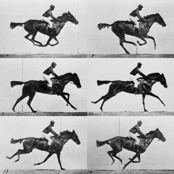
It’s a rich and subtle essay that covers several key topics, and thinks in appropriately large terms; I’ll be returning to it. But just for now I want to zero in on an especially intriguing part of the essay in which Chimero meditates on Eadweard Muybridge’s early moving pictures of a running horse.

Of these images Chimero writes,
And you know, these little animations look awfully similar to animated GIFs. Seems that any time screens appear, some kind of short, looping animated imagery of animals shows up, as if they were a natural consequence of screens.
Muybridge’s crazy horse experiment eventually led us to the familiar glow of the screen. If you’re like me, and consider Muybridge’s work as one of the main inroads to the creation of screens, it becomes apparent that web and interaction design are just as much children of filmmaking as they are of graphic design. Maybe even more so. After all, we both work on screens, and manage time, movement, and most importantly, change.
So what does all of this mean? I think the grain of screens has been there since the beginning. It’s not tied to an aesthetic. Screens don’t care what the horses look like. They just want them to move. They want the horses to change.
Designing for screens is managing that change. To put a finer head on it, the grain of screens is something I call flux.
He then goes on to define high, medium, and low flux, and to describe some situations in which one or the other might be called for.
All this has me thinking about the degree of flux appropriate to different reading experiences. This seems to me highly variable according to genre and purpose. For instance, the New Republic’s iPad app is designed to offer higher flux than other magazine apps I’ve seen, which are minimally interactive: here you have poems that you can use your finger to slide into view, taps that activate deeper levels of content, and so on. Sometimes it’s too much, and at other times it takes too long to figure out how a given story works — they vary more than they ought to — but in general I like it. A good deal of thought has gone into the design, and more often than not the interactions are appropriate to the particular story and help me to engage more fully with it.
But I would never want to read Anna Karenina this way. The kind of concentration demanded by a long, complex, serious novel cannot bear much, if any, flux. And unnecessary flux can readily be avoided by reading it in a codex — hooray for that! But if people do gradually shift more and more towards reading on some kind of screen or another, and screens become increasingly capable of variable degrees of flux (as e-ink screens currently are not), then we readers will be ever more dependent on designers who possess a deep sensitivity to context and purpose — pixel-based designers who are widely, as a matter of basic professional competence, as flexible and nuanced in their design languages as the best print-based designers are today. Or, at the very least, they’ll need to build in the possibility of opting out of their fluxier interfaces. As someone who’s headed for a more screen-based reading future, I’m a little nervous about all this.
