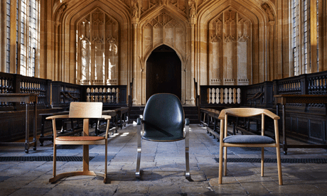
The Bodleian Library at Oxford needs new chairs, and has commissioned designs. Above are the three finalists. Like the author of that Guardian report, I strongly prefer the Barber Osgerby design on the left. It’s a classically modernist shape, but with traditionalist elements I think will harmonize with its surroundings.
I post this as another installment in my ongoing love letter to libraries. Libraries need seats that people will want to sit in, and while big soft chairs are especially desirable for people who just want to read, there’s still a need for good desk chairs to suit those occasions when one must summon all the research and do some serious typing — or even serious underlining and annotating. I could see myself getting good work done in that Barber Osgerby chair.


I think I agree with your choice. The one on the right looks extremely uncomfortable, and I suspect the thin legs would break easily. People will tilt back — yes, even in the Bodleian — and those things'll snap right off.
The middle one looks like something from a bus station. Plus leather covers tend to get ripped easily.
The one on the left not only looks pretty, but it also looks comfortable and fairly sturdy. And reading the article, I see that there's a bit of rock built into the floor part. I think we have a winner.
We recently had a bit of a chair snafu in our library. We bought a bunch of new chairs for the computer carrels, with wheels on the bottoms of them. And then we proceeded to tally up five broken wheels in four days. We sent them all back.