A while back I posted on the great spaces-after-a-period controversy and the revelation by one Heraclitus that typographic history is more varied and complicated than certain modern scolds would have you believe.
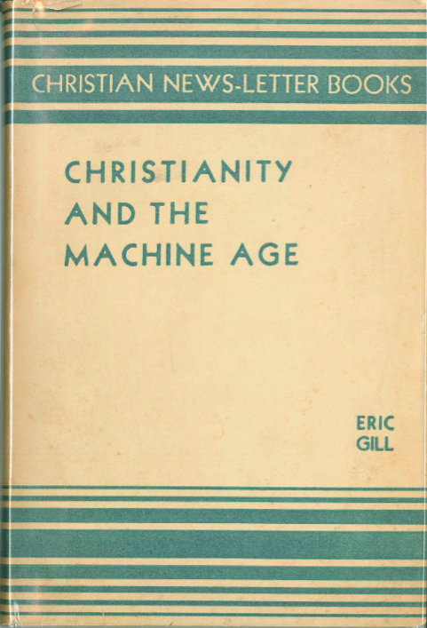
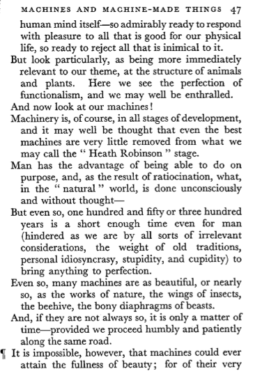
As part of my research on Christian humanism and World War II, I’ve been reading the little book whose cover is pictured above, by the great genius and filthy disgusting pervert Eric Gill. I doubt that Gill had complete control over the typesetting of this book, though it does bear some of the characteristic marks of his typographic practice, but it’s interesting to look at all the same. Consider this page:
Let’s take a moment to note the distinctive elements here: the hanging indents; the use of the pilcrow to indicate a new section; wide spacing after some sentences; spaces separating quotation marks from the words or phrases quoted. It’s a reminder to me that the typographic conventions of today’s books are pretty rigid in comparison — a function, perhaps, of almost every printed book being typeset with a tiny handful of computer applications, which practice leaves little room for personal typographic style? I don’t know about you, but I wouldn’t mind being surprised by typography more often than I am.


Don Knuth invented TeX 35 years ago, in 1978, because he wanted full control over typesetting. It is quite feasible to specify exactly what you want things to look like through TeX. The only real problem is this paradox: the personal computing revolution (in the form of "easy" to use tools such as Word) has made it easy for regular people (who are not typesetters) to simply rely on defaults, rather than (as some in the original computing movement had hoped) to empower people to use computers to showcase their individuality at all levels.