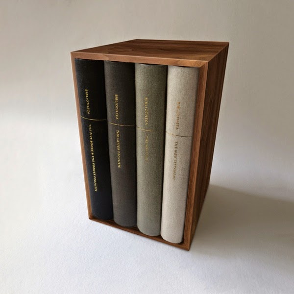

Bibliotecha is a remarkably successful new Kickstarter project for designing and printing a Bible made to be read, in multiple volumes and with bespoke type design. Here is the Kickstarter page; here is part one of an interview with Adam Lewis Greene, the designer; and here is the second part of that interview.
Lots and lots of things to interest me here. At the moment I’m just going to mention one, an exchange from the second interview:
J. MARK BERTRAND: Your decision not to justify the text column threw me at first. Now I think I understand, but since I’m a stickler for Bibles looking like books meant to be read, and novels are universally justified, could you explain what’s at stake in the choice to leave the right margin ragged?
ADAM LEWIS GREENE: This goes back, again, to the idea of hand-writing as the basis for legible text. When we write, we don’t measure each word and then expand or contract the space between those words so each line is the same length. When we run out of room, we simply start a new line, and though we have a ragged right edge, we have consistent spacing. The same is true of the earliest manuscripts of biblical literature, which were truly formatted to be read. I’m thinking of the Isaiah scroll, which I was privileged to see in Israel last year and is the primary model for my typesetting….
Unjustified text was revived by the likes of Gill and Tschichold early in the last century, and it continues to gain steam, especially in Europe. We are starting to see unjustified text much more frequently in every-day life, especially in digital form, and I would argue we are slowly becoming more accustomed to evenly spaced words than to uniform line-length. To me, justified type is really a Procrustean Bed. Too many times while reading have I leapt a great distance from one word to the next, only to be stunted by the lack of space between words on the very next line. I admit, I think justified text looks clean and orderly when done well, but it doesn’t do a single thing in the way of legibility. It is simply what we have been accustomed to for a long time, and since this project is partially about breaking down notions of how things “ought to be,” I ultimately decided to go with what I believe is the most legible approach; not to mention its suitability for ancient hand-written literature.
I couldn’t agree more with Greene’s decision here. I have long believed that we pay too high a price in legibility to get the perfect rectangles of fully justified text. In my experience, the single greatest source of distraction coming from a text (as opposed to the distractions that arrive from the outside) is variable spacing imposed by the demands of justification.
When my book The Pleasures of Reading in an Age of Distraction was being typeset for publication, I made two requests of the designer. First, I wanted it set in Eric Gill’s Perpetua; and second, I wanted ragged-right justification. To my astonishment, both of my requests were granted.
